Styling shelves like an interior designer is about creating a balanced mix of function and personality. It involves thoughtfully arranging books, art, and decorative objects to form a cohesive and visually appealing display. The key is to layer items of varying heights and textures while avoiding clutter to achieve a polished, effortless look.
A well-styled shelf elevates any room by adding interest and bringing a sense of harmony to the space. Designers emphasize using meaningful objects that reflect the owner’s personality and carefully curating seasonal or statement pieces to keep the display fresh and intentional.
Understanding how to balance visual appeal with practicality allows anyone to transform ordinary shelves into a focal point. This process requires attention to scale, color coordination, and strategic placement rather than simply filling space.
Understanding Shelf Styling Essentials

Effective shelf styling requires careful attention to the choice of objects, their arrangement, and overall harmony. Balancing visual weight, avoiding clutter, and layering items thoughtfully contribute to making shelves look intentional and well designed.
What Makes Shelves Look Designer
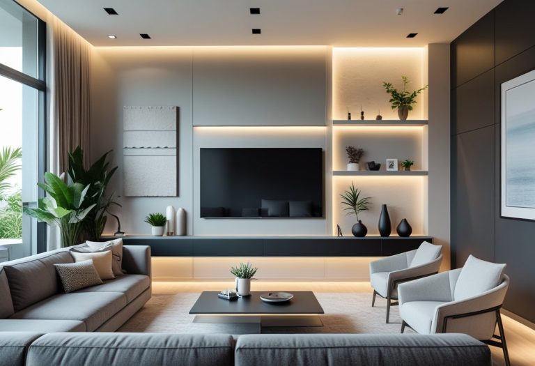
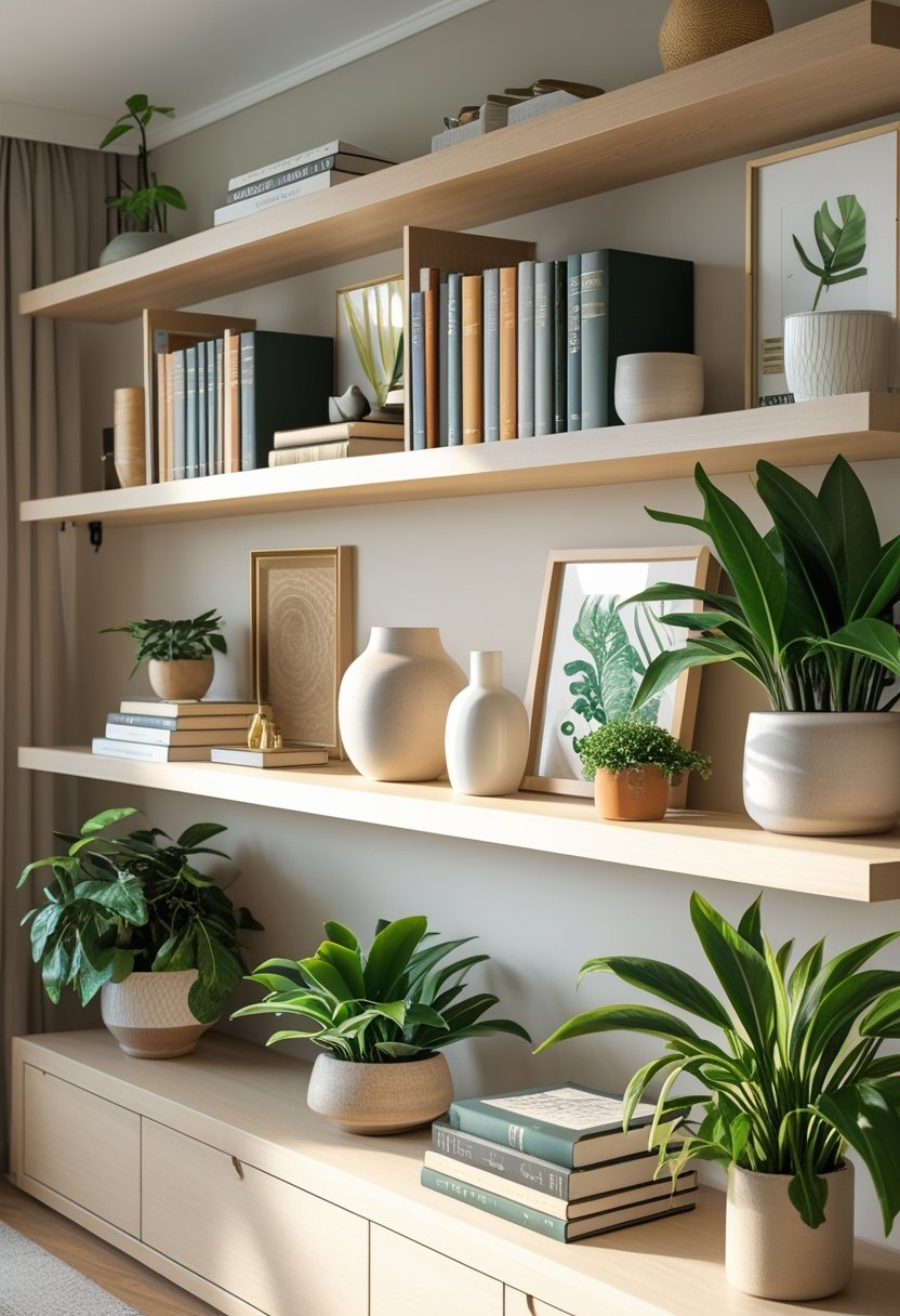
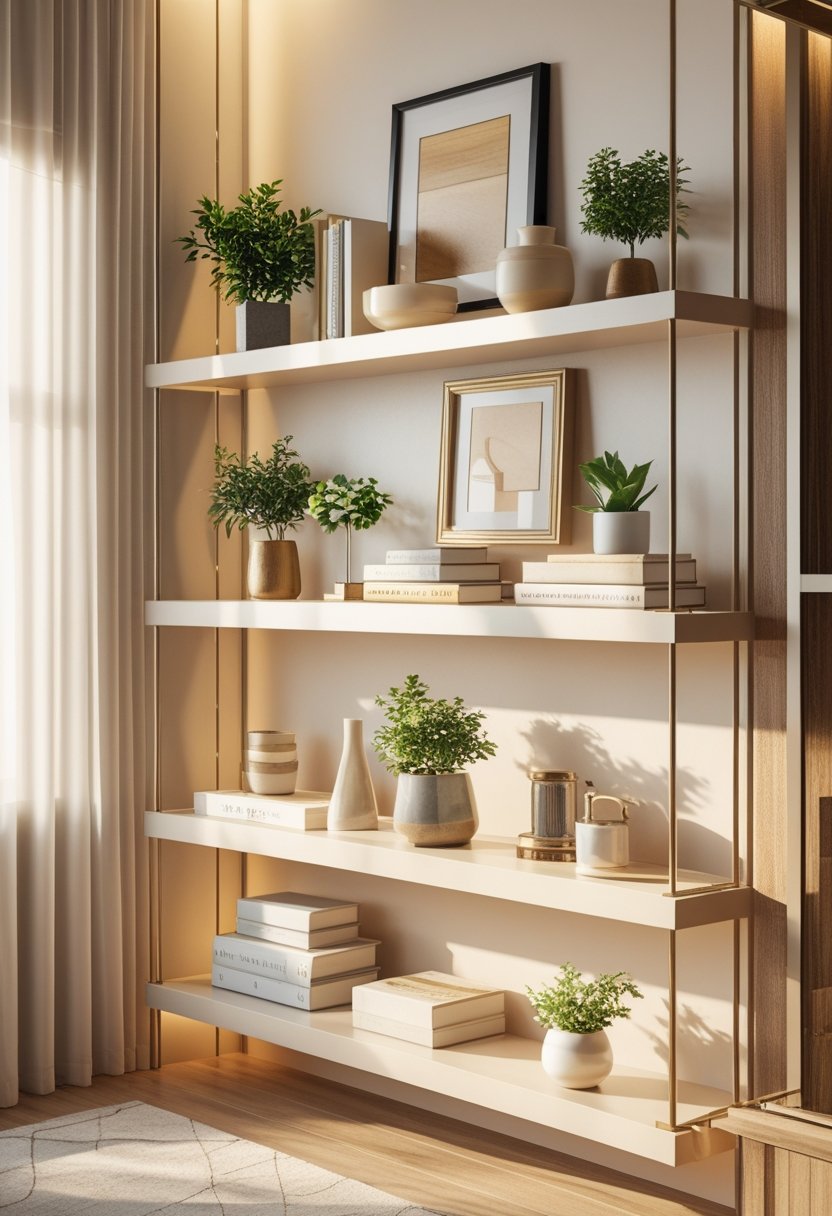
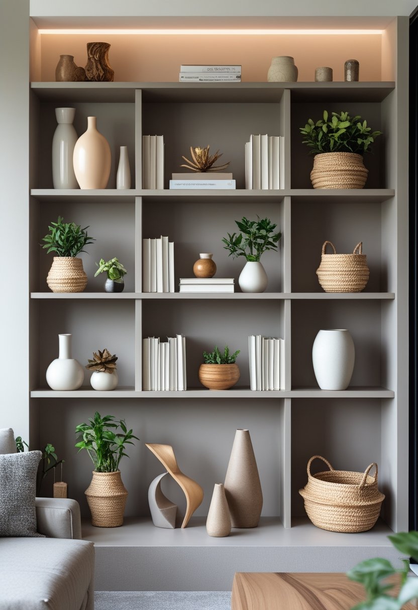
Designer shelves combine both function and aesthetics. They often feature a curated mix of items such as books, decorative objects, plants, and personal mementos arranged with deliberate spacing. Each object should have a purpose, either practical or decorative, reflecting personal style without overwhelming the space.
Texture and color variation are vital. Mixing materials like wood, metal, and glass keeps the display dynamic. Incorporating plants or organic elements introduces life and softness. Negative space is equally important—empty spots prevent the shelf from appearing cluttered and highlight featured pieces.
The Importance of Visual Balance
Visual balance ensures a shelf feels stable and pleasing to the eye. This can be achieved by distributing objects of different heights, shapes, and weights evenly across the shelf. Symmetry is not required; instead, asymmetrical arrangements that balance larger and smaller items work well.
Layering items creates depth. Placing taller objects at the back and shorter ones in front helps guide the viewer’s eye naturally. Grouping items in odd numbers (3 or 5) creates interest, and mixing vertical and horizontal elements prevents monotonous lines.
Common Shelf Styling Mistakes
Overcrowding is one of the most frequent mistakes in shelf styling. Filling every inch reduces impact and creates visual chaos. In contrast, under-styling leaves shelves feeling bare and unfinished.
Another error is using objects purely for decoration without considering their relationship to each other. Items should complement, not compete. Ignoring scale can cause imbalance, such as placing a very large piece on a small shelf or vice versa.
Finally, styling without consistency to the room’s overall decor or personal style results in an incoherent look. Shelves are part of the space’s narrative and should reflect its character.
Planning Your Shelf Layout

Effective shelf styling starts with a clear plan. It requires understanding how the shelves will be used, how they fit into the room’s overall aesthetic, and preparing the space to receive new items in an organized way. This approach helps avoid clutter and creates a balanced, intentional display.
Assessing Shelf Function and Purpose
Before arranging items, it is essential to define what the shelves will primarily be used for. Will they serve as storage, display, or a mix of both? For functional shelves, such as those in a kitchen or office, prioritize accessibility and organization. Decorative shelves in living or dining rooms can focus more on visual appeal and thematic elements.
He or she should also consider who uses the shelves daily. If children or guests frequently access them, durability and safety become priorities. Balancing practicality with style ensures the shelf remains both useful and attractive. Identifying specific needs early simplifies decisions about what and how to style the shelves.
Evaluating Room Aesthetics
The shelves should complement the existing decor and architectural style of the room. It’s important to take note of room colors, materials, and lighting when styling shelves. This evaluation ensures the shelf layout enhances rather than disrupts the space.
He or she might select color-coordinated items or mix textures for contrast, but the overall look should feel cohesive. Positioning shelves near natural light or using spotlighting can highlight key objects and add depth. Keeping scale in mind—larger pieces on lower shelves and lighter objects higher—creates a natural visual flow.
Starting with a Clean Slate
Starting with an empty shelf promotes clear planning and intentional design. Removing all items reveals the full space to style and prevents overcrowding. It also makes it easier to group items by size, color, or theme before arranging.
He or she should dust and clean shelves thoroughly to present a fresh canvas. Then, sorting items into categories such as books, decor objects, plants, and personal mementos helps create a balanced mix. This deliberate approach leads to a styled shelf that looks thoughtfully curated, not cluttered.
Mastering Shelf Arrangement
Effective shelf styling requires careful placement and thoughtful balance. This involves grouping items in meaningful ways, using specific numerical rules, and allowing space to enhance visual clarity. Each step contributes to a shelf display that feels intentional rather than cluttered.
Grouping Objects Effectively
Grouping objects creates cohesion and visual interest on shelves. Items with similar colors, themes, or textures should be placed together to form clear, attractive clusters. This technique draws attention and prevents the shelf from appearing chaotic.
Groups of three to five objects work well, avoiding overcrowding. Mixing different shapes and heights within a group adds dimension. For example, pairing a small plant with a stack of books and a decorative bowl creates variety while maintaining unity.
Using a common element, like color or material, helps tie groups together. It’s important to vary group sizes across the shelf to maintain balance, distributing visual weight evenly along the surface.
Applying the Rule of Odds
The rule of odds is a fundamental principle in styling shelves. It suggests that an odd number of items—usually three, five, or seven—creates a more dynamic and appealing arrangement compared to an even number.
Odd numbers allow one piece to act as a focal point, supported by the others. This asymmetry feels natural and inviting. For shelving, this might mean displaying three accessories in a group or stacking five books with decorative objects interspersed.
This rule helps prevent displays from looking overly symmetrical or too uniform. When styling shelves, combining various odd-numbered groups creates rhythm and visual flow across the space.
Using Negative Space Wisely
Negative space, or empty space, is as important as the items on the shelf. Leaving intentional gaps prevents overcrowding and helps each object stand out.
Too many objects cramped together make a shelf look cluttered and chaotic. By introducing breathing room, the eye can rest and focus on individual items. This approach enhances the overall clarity and sophistication of the display.
Negative space also helps to create balance between grouped elements. It can be adjusted depending on shelf size—larger shelves require more space to avoid a sparse look, while smaller shelves benefit from tighter but deliberate spacing.
Mixing Materials, Textures, and Heights
Successful shelf styling uses a strategic combination of different materials, textures, and heights to create an engaging visual presentation. The right mix prevents monotony and adds complexity, drawing attention without cluttering the space.
Incorporating Varied Objects
A key to dynamic shelf styling is including objects made from different materials like wood, metal, glass, and ceramics. This variety creates tactile contrast and elevates visual interest. For example, combining a ceramic vase with a wooden bowl next to a metal frame keeps the display balanced and intriguing.
Mixing textures—smooth, rough, matte, or glossy—also adds depth. Natural elements like woven baskets or stone accessories can soften harder materials such as metal or glass.
Varying the color palette within a cohesive range helps unify disparate materials. Neutral tones with occasional warm or cool accents maintain harmony while showcasing diverse objects.
Balancing Heights and Shapes
Variation in height is essential to avoid flat or monotonous shelves. Tall items, like vases or framed art, paired with shorter pieces such as candles or small plants, create a rhythmic visual flow.
Using objects with different shapes—round, angular, or irregular—further enhances interest. Triangular groupings or the “Rule of Three” (grouping items in odd numbers) help achieve balance.
Placing the tallest or most eye-catching item off-center rather than symmetrically allows the display to feel deliberate but informal. This approach guides the eye naturally across the shelf.
Layering for Depth
Layering objects by placing some pieces slightly in front of others develops dimensionality. This technique moves the display beyond a flat plane, making the shelf feel fuller without overcrowding.
Start by positioning larger background pieces, like framed artwork or a tall vase. Then add smaller or mid-sized objects in front, overlapping carefully to avoid visual clutter.
Combining flat and three-dimensional objects also contributes to depth. For instance, a framed print behind a small sculpture or a stack of books layered with decorative bowls provides varied focal points.
Layering with plants or seasonal accents introduces softness and freshness, enhancing texture variety and adding life to the shelf.
Curating Decor and Color Schemes

A carefully chosen color palette and thoughtfully selected items create harmony on shelves. Shelves styled with balance between color and curated objects can elevate a room’s design. Seasonal adjustments keep the display fresh and aligned with changing moods or trends.
Selecting a Cohesive Color Palette
Choosing a cohesive color palette is fundamental to styling shelves like an interior designer. It starts with evaluating the existing colors in the room such as wall paint, furniture, and larger decor pieces. The shelf’s color choices should harmonize without forcing everything to match exactly.
Designers often select two to three primary colors and add accents to tie the display together. For example, neutral shades like beige or gray provide a stable base, while one or two accent colors—like muted blues or warm ochres—introduce personality and interest.
This approach prevents cluttered or chaotic visuals. A cohesive color palette helps the eye move smoothly across the shelf, emphasizing the key items rather than distracting from them.
Coordinating Decorative Books and Art
Decorative books and art should complement each other and the overall shelf style. Books can be arranged by color, size, or theme to create visual order. Placing books horizontally with a few vertical stacks breaks monotony and adds dimension.
Art pieces—whether framed photos, small canvases, or sculptural objects—act as focal points. Balancing these with the books and smaller decor items is crucial. Objects should vary in height and texture to create layers but maintain eye-level viewing comfort.
Grouping items in odd numbers (three or five) encourages natural balance. This strategy draws attention to personal treasures without overwhelming the shelves.
Rotating Items Seasonally
Adjusting shelf decor seasonally refreshes the space and aligns it with changing moods. Simple swaps like swapping bright, light-colored objects for richer hues in fall can make shelves feel timely and intentional.
Rotating items also includes rethinking textures—adding natural elements like wood or woven baskets in winter, or ceramic vases and green plants in spring. This method keeps shelves dynamic and prevents the space from feeling static or stale.
A seasonal rotation also encourages thoughtful editing, helping to maintain a curated, uncluttered look throughout the year.
Enhancing with Greenery and Personal Touches

Incorporating greenery and personal items adds dimension and warmth to shelf displays. Balancing texture and meaning transforms shelves from purely functional to inviting focal points. Careful selection and arrangement keep the look natural, avoiding clutter or stiffness.
Adding Real and Faux Plants
Using plants on shelves introduces life and color, breaking up hard lines with organic shapes. Real plants bring fresh air and seasonality but require light and care. Choose small potted succulents, trailing vines, or air plants for ease of maintenance.
Faux plants offer consistent greenery with zero upkeep, ideal for low-light areas. Opt for quality faux foliage that mimics natural texture to avoid an artificial look. Grouping plants at varying heights, in odd numbers, creates visual interest and depth without overcrowding the shelf.
Pair greenery with contrasting materials such as woven baskets or stone planters to add tactile variety. This mix prevents the display from feeling too uniform or sterile, supporting a balanced, layered appearance.
Showcasing Sentimental and Unique Items
Personal objects inject character and narrative into shelf styling. Items like vintage cameras, travel souvenirs, handmade crafts, or framed photos provide conversation starters and emotional resonance.
Select a handful of meaningful pieces rather than crowds of small trinkets. Rotate sentimental items seasonally or by theme to keep the shelf dynamic and relevant. Group items with complementary colors or shapes to maintain cohesion while highlighting individuality.
Using unique objects alongside plants and books creates a curated yet lived-in ambiance. The key is harmonizing personal treasures with decorative and functional objects for a balanced, intentional arrangement.
Maintaining and Refreshing Your Shelves

Regularly updating shelves helps retain their visual appeal and practical use. It involves balancing aesthetics with easy access to everyday items. Attention to shelf styling ensures they avoid becoming cluttered or outdated.
Keeping Shelves Functional
Functionality starts with clear categorization. Group similar items, such as books, decorative objects, and plants, to maintain order and quick accessibility. Using containers or baskets helps organize smaller items without sacrificing style.
Proper spacing is essential. Leave some negative space to avoid overcrowding; this enhances both usability and appearance. Rotate or swap seasonal decor to keep the display fresh and relevant throughout the year.
Maintenance includes routine dusting and checking the stability of shelves. Ensuring shelves aren’t overloaded preserves their structural integrity. Combining practical storage with style keeps shelves useful and attractive.
Troubleshooting Common Issues
Clutter buildup is the most frequent problem in shelf styling. Remove or relocate items that don’t serve a clear purpose or disrupt the design balance. Simplifying the arrangement can prevent visual chaos.
If shelves appear too sparse or uneven, layering items by height and texture adds dimension. Mixing books, artwork, and small plants creates a cohesive look without overwhelming the space.
For shelves that seem static or stale, changing one or two key pieces revitalizes the entire arrangement. Avoid the trap of an overly curated or rigid display by allowing some flexibility in styling choices.

Ana Luisa
Explore in-depth biographies, net worth insights, and exclusive updates on your favorite singers at Trionua.com. Discover the journeys, achievements, and latest news about music’s biggest stars.